
Claude Skills in Practice: Create a Poster with Canvas Design and Style a Presentation with Theme Factory without designer help
Without a design background, I used Claude to create a poster and presentation draft that I could bring into a discussion. In this experiment, I used a fictional shampoo brand: Canvas Design helped turn the website’s visual style into a poster, and Theme Factory helped carry its colours and typography into a five-slide product presentation.
The two Skills serve different purposes:
Canvas Design: Establishes a design philosophy before creating static visuals such as posters, primarily delivered as PDF or PNG files.
Theme Factory: Provides colour and font themes to help materials such as websites, posters and presentations maintain a consistent brand style.
For me, the biggest benefit was having something concrete to discuss with a manager, colleague or designer. The results still needed checks for product accuracy, wording, brand consistency and readability before deciding how to use them.
Why did I try using Claude to create a poster and presentation?
If you had to introduce a new product in two days, but had neither a poster nor a presentation ready, what would you do?
I don’t have a design background, and I can’t always get help from a designer immediately. In that situation, I want to create a first draft so everyone has something tangible to discuss.
For this experiment, I continued working with the fictional shampoo brand from my earlier demo, using its existing website as the visual starting point. My goal was to create a product poster and a presentation explaining the design direction to a manager.
What is Canvas Design, and what can you use it for?
Canvas Design is a Skill that helps Claude create static visuals such as posters and artwork. It works in two stages: first establishing a design philosophy, then expressing that philosophy visually, primarily as a PDF or PNG.
The “design philosophy first” approach is worth understanding.
Suppose I simply ask: “Create a premium-looking shampoo poster.”
One person might imagine a dark background with gold lettering. Another might picture natural light, a pale background and plenty of empty space. Both could feel premium, but neither necessarily matches what I have in mind.
A design philosophy makes that vague request more specific. It describes the feeling the work should convey and helps guide composition, colour and spacing.
For example, if I want the poster to suggest the relaxing experience of washing your hair, that idea can guide how the product is positioned, how simple the background should be and how soft the lighting feels.
Canvas Design emphasises visual communication, keeping text to the essentials. For this experiment, I focused the poster on the product, brand name and a single tagline. The detailed product introduction and design explanation went into the presentation.
What is Theme Factory, and how does it help maintain brand consistency?
Theme Factory provides reusable colour and font themes, giving Claude a shared visual reference when creating different materials.
A website, poster and presentation might each look fine on their own, yet feel disconnected when placed together. The website might use dark green, the poster a brighter green, and the presentation an entirely different set of fonts.
Theme Factory helps organise these visual choices. A theme includes specific colour codes and font pairings for headings and body text, which can be applied across materials.
Once a theme is agreed on, you can reuse it instead of choosing colours and fonts again for every new piece of content.
Can you use Theme Factory without knowing colour theory?
Yes. Theme Factory provides ten preset themes. It shows a preview, lets you choose, and then applies the corresponding colours and fonts. If none fits, you can also ask for a custom theme.
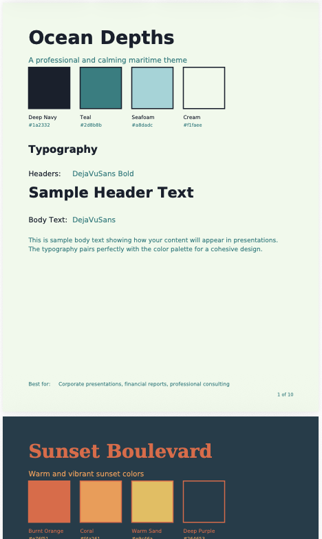
For someone without a design background, the starting point can simply be: “Which of these feels closest to my brand?”
If I already have a website or brand guidelines, I give them to Claude and ask it to follow them. Providing official colour codes and font names is more precise than asking it to estimate them from screenshots.
I also ask Claude to explain how each colour should be used—for backgrounds, headings or highlights—so there is a clearer basis for applying the theme later.
Can Theme Factory create an entire presentation on its own?
Theme Factory mainly handles the visual theme. Planning the presentation’s content and producing the file still require Claude’s relevant capabilities and tools.
Alongside the brand style, I therefore need to explain who the presentation is for, what they should understand and which decisions need their approval.
Step 1: Prepare the website, product information and visual references
I started with the existing brand website, then used Refero to find a visual reference close to what I had in mind.
For me, the hardest part is often explaining what I like. A reference image makes it easier to point to specific elements: the colours, the spacing or the way the product is positioned.
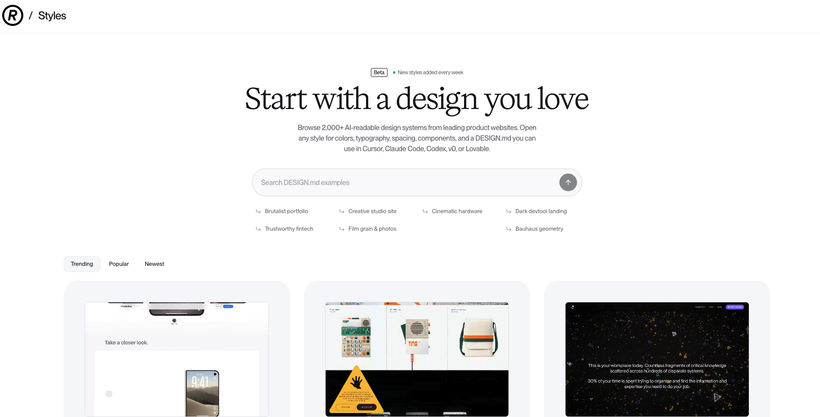
If I only provide an image, Claude may not know which part I want it to take inspiration from. Adding a sentence or two makes the direction clearer.
To try this yourself, prepare:
Screenshots of your brand website or existing brand materials.
Product images, the brand name and essential copy.
A reference image, with a short explanation of what you like about it.
You can adapt this prompt to your product:
Use Canvas Design to create a new-product poster for the shampoo brand in the attached materials.
Make the product the focal point and include the brand name and one tagline. Aim for a natural, clean and refined look that continues the visual style of the brand website.
Use the reference image to understand the colour, spacing and lighting direction, while developing an original composition.
Explain the design philosophy first, then create the poster draft. The poster will be viewed on a phone, so make sure essential text is clearly readable.
Step 2: Create the poster draft with Canvas Design
Claude proposed a direction called “Everyday Still Life,” treating the shampoo bottle as an everyday object worth appreciating through its arrangement, lighting and composition.
I wasn’t familiar with the phrase at first, so I asked Claude to explain it. Once I understood the idea, the design choices made more sense to me.
The lighting and shadows stood out in the result. Soft shadows connected the product, display platform and background, giving the overall image a calm, relaxed feeling close to what I had wanted.
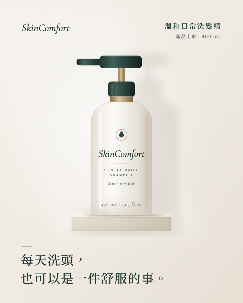
As a first draft for discussion, I was pleased with the result.
Having an image also made feedback more specific. I could say: “Keep the lighting, but make the product stand out more,” “Remove some background elements,” or “Make the tagline easier to read.”
This experiment showed me that a design philosophy can guide revisions as well as the initial creation.
Step 3: Create a five-slide presentation with Theme Factory
Once the poster was ready, I asked Claude to use Theme Factory to carry the website and poster’s style into a presentation explaining the design direction to a manager.
The five slides covered:
The product concept we wanted to communicate.
Brand colours, visual style and product features.
The finished poster.
The reasoning behind the design.
Items requiring the manager’s confirmation.
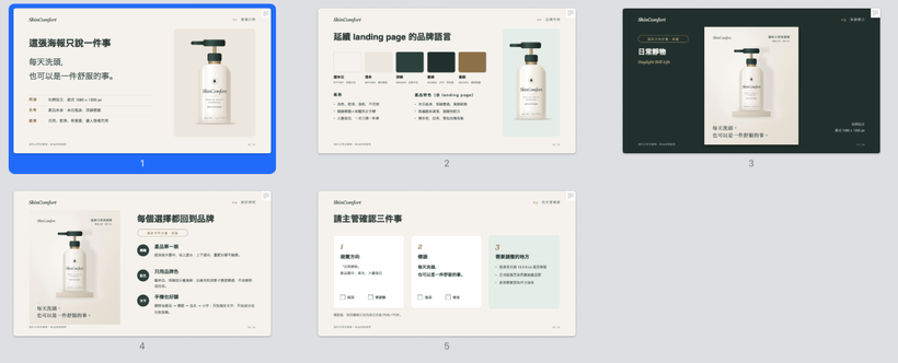
Although Theme Factory offers preset themes, I wanted to continue the existing brand style. Claude therefore created a custom theme based on the website.
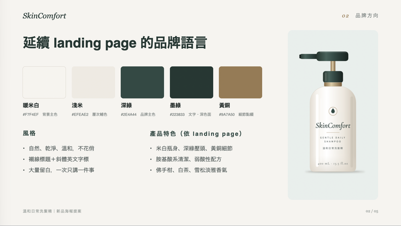
The second slide surprised me most. It brought the colour palette, brand style and product features together in one view, making the overall direction easy to understand.
With my own design skills, I would find it difficult to create a layout like that. It also gave me a useful way to explain how the poster connected to the original website.
For an internal presentation, you could start with this prompt:
Using the attached brand website and poster, create a five-slide presentation explaining the design direction to my manager. Use Theme Factory to establish consistent colour and typography rules.
Include the product concept, brand visuals, poster, design rationale and items requiring the manager’s confirmation.
List the colour codes and their intended uses, along with the heading and body fonts. The presentation will be in Traditional Chinese, so confirm that the fonts support it.
Show me the proposed theme for approval before creating the presentation. Where information is missing, mark it as “To be confirmed.” Do not invent product benefits or market data.
What still needs human review?
This experiment produced drafts for a fictional brand. It does not establish that every product will achieve the same quality. For a real product, I would check:
Product accuracy: Do the packaging, logo, product name and copy match the actual product?
Brand consistency: Do the colours and fonts follow the agreed guidelines?
Content accuracy: Has Claude added unsupported product benefits, features or market figures?
Readability: Is essential text still clear when viewed at phone size?
File suitability: A PDF or PNG does not necessarily include an editable design source file.
If a designer will continue the work, clarify the required files at the beginning and keep the product assets and design explanation.
How can you save your preferences for next time?
Save the approved theme and revision guidelines, then ask Claude to read them when starting the next task.
Installing a Skill does not mean Claude will always remember your preferences. Saying “Make it similar to last time” can still produce different results.
I would save the colours and their uses, font names, approved examples and design approaches I want to avoid. These give the next project a clearer starting point.
After repeating the work a few times and settling on a reliable process, you could use Skill Creator to turn the requirements into a reusable Skill, then refine it through testing and feedback.
For example, the process could be: read the brand materials, confirm the purpose, create the poster, prepare the manager’s presentation and list any outstanding questions.
That is a possible next step. This experiment focused on Canvas Design and Theme Factory.
What did this experiment change for my work?
The biggest benefit was being able to turn an idea into a concrete first draft.
When discussing it with a manager, colleague or designer, I can point to the work and say: “Let’s keep this direction,” “The product needs to stand out more,” or “There is too much information on this slide.” That makes it easier to establish shared expectations.
If you want to try it, start with a product you know well. Gather the existing materials, create one poster, and then turn it into a three-to-five-slide presentation. Review what you would keep and what needs changing. Those decisions can become useful guidance for the next project.
Which causes more difficulty in your work: posters or presentations? Let me know which you would try first.
References